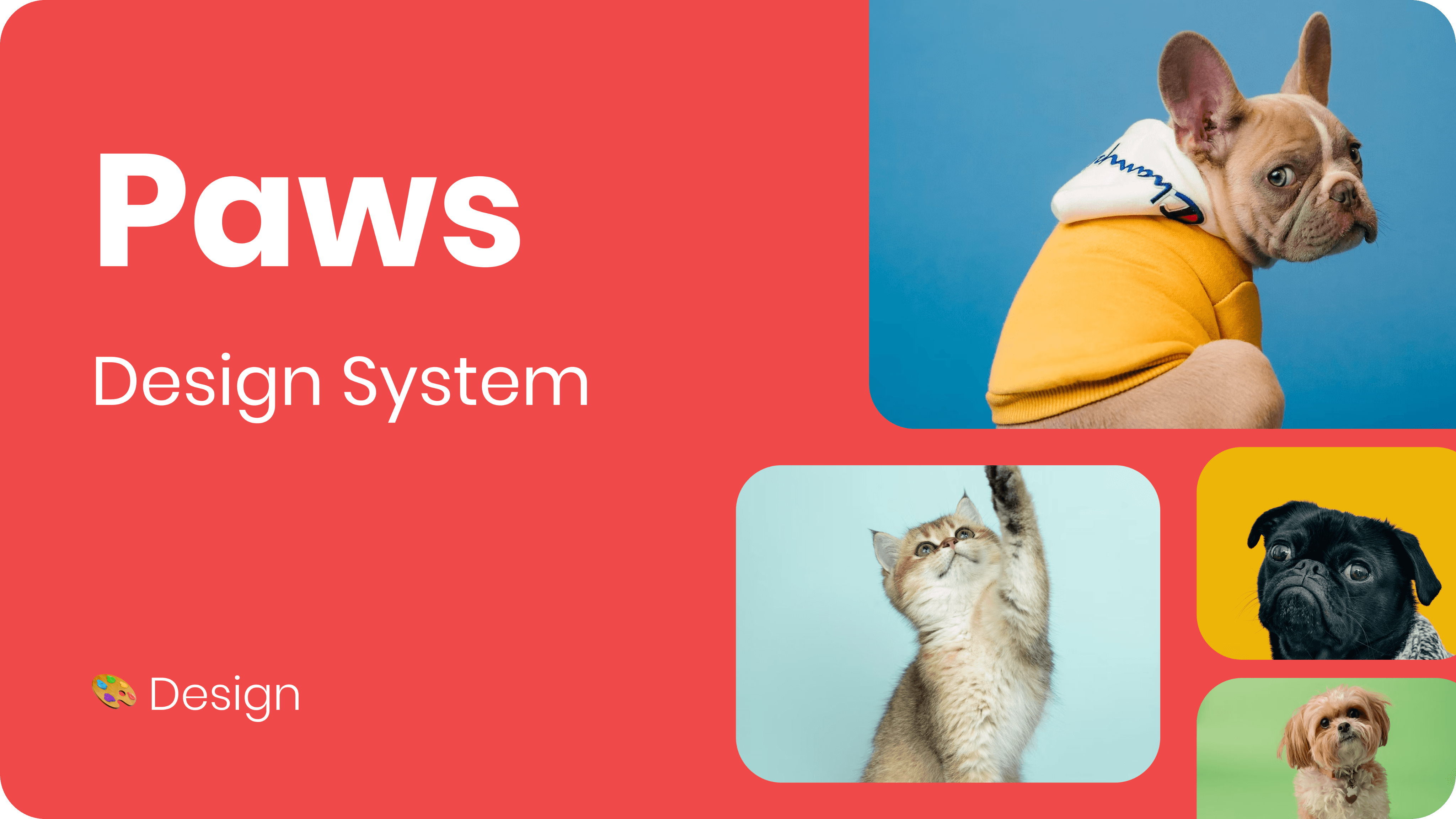
PAWS
Improving the checkout and navigation to make it clearer, reduce drop-offs by 78%, and simplify subscriptions.
Improving the checkout and navigation to make it clearer, reduce drop-offs by 78%, and simplify subscriptions.
Improving the checkout and navigation to make it clearer, reduce drop-offs by 78%, and simplify subscriptions.
Paws is an open, warm, and friendly brand for pet owners. It is an online website that provides pet food and pet supplies.
Year
2022
Role
UX/UI Design
Project length
3 months
Team
Project Manager
UX/UI Junior Designer
UX/UI Senior Designer
Lead Designer
4X Developers

Problems
PAWS was not selling as expected. Users abandoned the checkout process for subscriptions due to hidden fees and an unclear subscription summary.
The interface was difficult to navigate, making it challenging for users to find the right products, edit and manage their subscriptions, and follow a clear path to complete the checkout process.
Solutions
We implemented a straightforward subscription checkout process that allows users to see all costs and available discounts upfront. This transparency ensures that there are no hidden fees or confusing elements during payment. As a result, we have reduced the rate of drop-offs during the checkout process by 78%.
We developed a new design system aligned with the new brand essence, which brought a more effective user interface. This interface enhanced the mega navigation for searching for the right products, improved the subscription settings by displaying upcoming orders, and created a more intuitive checkout process.


I created a new Paws design system using the Vue storefront as the front-end framework and the atomic design methodology to streamline the process. Ensure consistent, scalable components for various breakpoints and devices that are easy to swap and align with the 8-pixel grid system.
I created a new Paws design system using the Vue storefront as the front-end framework and the atomic design methodology to streamline the process. Ensure consistent, scalable components for various breakpoints and devices that are easy to swap and align with the 8-pixel grid system.


Clear checkout process and transparency in advance
The new checkout process has a clear navigation that shows progress throughout the steps, clearly outlining the actions needed to complete the payment.
The new checkout process has a clear navigation that shows progress throughout the steps, clearly outlining the actions needed to complete the payment.

On the right side of the page, users can now clearly see a summary of the entire payment for one purchase products along with a detailed subscription summary below.
On the right side of the page, users can now clearly see a summary of the entire payment for one purchase products along with a detailed subscription summary below.

Informations provided at once
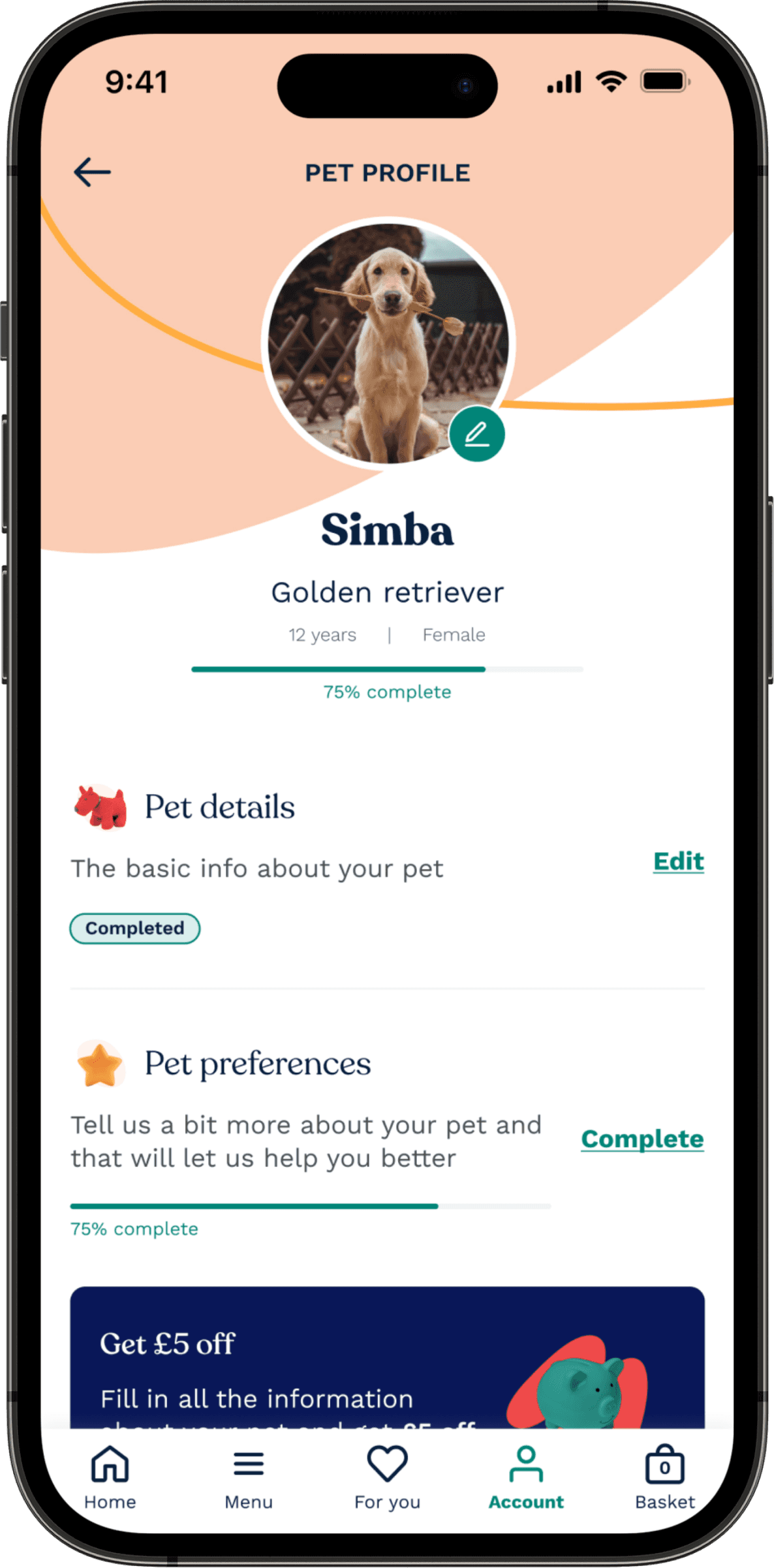
The new subscription page shows users all the details about their subscriptions. Users can see upcoming orders, payment information, and delivery details. There is also a tab for viewing both active and paused subscriptions. Users can easily edit or delete any subscription from this page.
The new subscription page shows users all the details about their subscriptions. Users can see upcoming orders, payment information, and delivery details. There is also a tab for viewing both active and paused subscriptions. Users can easily edit or delete any subscription from this page.

Account screens on mobile
Different screens for the Account Page on mobile.
Different screens for the Account Page on mobile.

Impact & Takeways
78% reduction in checkout drop-offs due to improved transparency and usability.
A more consistent and scalable design system, enhancing long-term maintainability.
Improved customer satisfaction with a seamless subscription experience that encouraged retention.
This project taught me how important transparency and usability are for reducing friction. It also showed me the benefits of having a scalable design system for long-term efficiency. Finally, I learned how a seamless experience can help keep customers.
Copyright © Alessio D'Angelo
Let’s work together
Let’s work together
Let’s work together